GitHub Cuts

GitHub recently announced its paper cuts initiative to fix minor issues that make things more difficult for GitHub users. As someone who spends most of his day on github.com, this initiative is great, as these small cuts can quickly add up to a painful experience.

The initiative has already made some great fixes, such as making the diff markers unselectable and hovercards. Small changes like these are usually quite easy for GitHub to do, but they make a huge difference to those of use who use GitHub every day.

I recently asked how these cuts could be reported to GitHub for fixing, but got no response. So I am writing this blog post.

To be very clear: I think that on the whole GitHub is great and they are doing a great job. And it's still better than the alternatives (to put things in perspective, I recently spent half an hour trying to figure out how to change my password in BitBucket, and GitLab can't even keep me logged in between sessions). GitHub has and continues to revolutionize the open source ecosystem, and is still the best place to host an open source project.

But since GitHub did ask what sorts of changes they want to see, I'm providing a list. In this post I'm trying to only ask about things that are small changes (though I realize many won't be as easy to fix as they may appear from the outside, and I readily admit that I am not a web developer).

These are just the things that have bothered me, personally. Other people use GitHub differently and no doubt have their own pain points. For instance, I have no suggestions about the project boards feature of GitHub because I don't use it. If you are also a GitHub user and have your own pain points feel free to use the comment box below (though I have no idea if GitHub will actually see them).

If you work for GitHub and have any questions, feel free to comment below, or email me.

In no particular order:

Issues

  1. Allow anyone to add labels to issues. At the very least, allow the person who opened the issue to add labels.

  2. The new issue transfer ability is great, but please make it require only push access, not admin access.

  3. Remove the automatic hiding of comments when there are too many. I understand this is done for technical reasons, but it breaks Cmd-F/scrolling through the page to find comments. Often I go to an issue trying to find an old comment and can't because buried in the comments is a button I have to press to actually show the comment (it's even worse when you have to find and press the button multiple times).

  4. Better indication for cross-referenced pull requests. I really don't know how to fix this, only that it is a problem. It happens all the time that a new contributor comes to a SymPy issue and asks if it has been worked on yet. They generally do not seem to notice the cross-referenced pull requests in the list. Here is an example of what I'm talking about.

  5. Indicate better if a cross-referenced pull request would close an issue. Preferably with text, not just an icon.

  6. HTML pull request/issue templates. I don't know if this counts as a "cut", as it isn't a simple fix. Right now, many projects use pull requests/new issue templates, but it is not very user friendly. The problem is that the whole thing is done in plain text, often with the template text as an HTML comment to prevent it from appearing in the final issue text. Even for me, I often find this quite difficult to read through, but for new contributors, we often find that they don't read it at all. Sure there's no way to force people to read, but if we could instead create a very simple HTML form for people to fill out, it would be much more friendly, even to experienced people like myself.

  7. Fix the back button in Chrome. I don't know if this is something that GitHub can fix, and I also do not know how things work in other browsers. I use Chrome on macOS. Often, when I click the "back" button and it takes me back to an issue page, the contents of the page are out-of-date (the newest comments or commits do not appear). It's often even more out-of-date than it was when I left the page. I have to reload the page to get the latest content.

  8. Allow Markdown formatting in issue titles.

  9. Show people's names next to comments as "Real Name (@username)". In general, GitHub should be emphasizing people's display names rather than their usernames.

  10. Remember my selection for the "sort" setting in the issues list. I'd love to have issues/pull requests sort by "most recently updated" by default, so that I don't miss updates to old issues/pull requests.

  11. Make advanced search filters more accessible. They should autofill, similar to how Gmail or even GitLab search works (yes, please steal all the good ideas from GitLab; they already stole all their good ideas from you).

  12. Tone down the reaction emojis. Maybe this ship has sailed, but reaction emojis are way too unprofessional for some projects.

  13. Copy/paste text as Markdown. For example, copying "bold" and pasting it into the comment box would paste **bold**. Another idea that you can steal from GitLab.

  14. Strike out #12345 issue links when the issue/PR is closed/merged (like #12345).

Pull requests

  1. Add a button that automatically merges a pull request as soon as all the CI checks pass. Any additional commits pushed to the branch in the interim would cancel it, and it should also be cancellable by someone else with push access or the PR author.

  2. Add some way to disable the automatic hiding of large diffs. This breaks Cmd-F on the page, and makes it harder to scroll through the pull request to find what you are looking for (typically the most important changes are the ones that are hidden!).

  3. Include all issue/PR authors in the authors search on the pull request list page. Right now it only lists people with push access. But I generally can't remember people's GitHub usernames, and autofilling based on all authors would be very helpful.

  4. Better contextual guesses for issue autofilling (after typing #). For instance, if an issue has already been referenced or cross-referenced, it should appear near the top of the list. We have almost 3000 open issues in SymPy, and the current issue numbers are 5-digits long, so referencing an issue purely by number is very error prone.

  5. Auto-update edited comments. Context: SymPy uses a bot that comments on every pull request, requiring a release notes entry to be added to the description. This works quite well, but to prevent the bot from spamming, we have it comment only once, and edit its comment on any further checks. However, these edits do not automatically update, so people have to manually reload the page to see them.

  6. Don't hide full commit messages by default in the commits view. It would be better to encourage people to write good commit messages.

  7. Make issue cross-references in pull request titles work. I'd rather people didn't put issue numbers in pull request titles but they do it anyway, so it would be nice if they actually worked as links.

  8. Allow me to comment on lines that aren't visible by default. That is, lines that you have to click the "expand" icon above or below the line numbers to access. As an example, this can be useful to point out a line that should have been changed but wasn't.

  9. Copying code from a diff that includes lines that aren't visible by default includes an extra space to the left for those lines. This is a straight up bug. Probably fixing the previous point would also fix this :)

  10. Make searches include text from the pull request diff.

  11. When a diff indents a line color the whitespace to the left of the line. (see this)

  12. Pull requests can show commits that are already in master. For example, if someone makes pull request B based off of pull request A and then A gets merged, B will still show the commits from A. This has been a bug forever.

  13. Make the "jump to file or symbol" popdown collapsible. Specifically what I mean is I want to be able to show just the files, without any symbols. For large pull requests, it is very difficult to use this popdown if there are hundreds of symbols. I typically want to just jump to a specific file.

  14. The status check on the favicon goes away when you switch to the diff tab. Kudos to Marius Gedminas for pointing this out.

  15. Apparently status checks that use the GitHub Apps API are forced to link into the checks tab. The checks tab is useless if no information is actually published to it. It would be better if it could link straight to the external site, like is done with oauth integrations.

  16. Make it easier to copy someone's username from the pull request page. I generally do this to git remote add them (using hub). If I try to select their username from a comment, it's a link, which makes it hard to select. I generally copy it from the blue text at the top "user wants to merge n commits from sympy:master from user:branch". If it were easier to select "user" or "branch" from that box (say, by double clicking), that would be helpful.

  17. Change the "resolve conversation" UI. I keep pressing it on accident because it's where I expect the "new comment" button to be.

Reviews

I wrote a whole post about the reviews feature when it came out. Not much has changed since then (actually, it has gotten worse). In short, the feature doesn't work like I would like it too, and I find the default behavior of deferred comments to be extremely detrimental. If there were a way to completely disable reviews (for myself, I don't care about other people using the feature), I would.

See my blog post for full details on why I think the reviews feature is broken and actually makes things worse, not better than before. I've summarized a few things that could change below.

  1. Make reviews non-deferred by default. This is the biggest thing. If I had to pick only a single item on this page to be changed, it would be this. The issue is if I start a review and walk away from it, but forget to "finalize" it with a review status, the review is never actually seen by anyone. The simplest way to fix this would be to simply make partial reviews public.

  2. Make Cmd-Enter default to immediate comment. Barring the above change, Cmd-Enter on a pull request line comment should default to immediate comment, not deferred (review) comment. The problem with the Cmd-Shift-Enter shortcut is that it is inconsistent: on a normal comment, it closes the pull request, and on a reply comment, it does nothing. I shouldn't have to check what "comment context" I am in to figure out what keyboard shortcut to use. The worst part is if you accidentally start a review, it's a pain in the ass to undo that and just post a normal comment. The simplest way to fix this would be to swap the current meaning of Cmd-Enter and Cmd-Shift-Enter for line comments (and no, this wouldn't be a backwards incompatible change, it would be a regression fix; Cmd-Enter used to do the right thing).

  3. Allow reviewing your own pull request. There's no reason to disallow this, and it would often be quite useful to, for instance, mark a work in progress PR as such with a "request changes" review. Obviously self-reviews would be excluded from any required reviews.

  4. Unhide the reviews box. It should just be the same box as the comment box, unstead of buried on the diff tab (see my blog post).

  5. Show review status in the pull request list as a red X or green check. This would make it easier to see which pull requests have reviews.

  6. Allow new commits to invalidate reviews. That way they work the same way as any other status check. (I see that this is now an option for required reviews, which is new since my original blog post, but it still doesn't affect the status as reported on the pull requests list).

  7. Allow requiring zero negative reviews to merge (but not necessarily any positive reviews). Requiring a positive review is pointless. The person merging can just add one real quick before they merge, but it is unnecessary extra work. On the other hand allowing people with push access to block a merge with a negative review would be very useful.

Web editor

  1. The web editor seems to have a search function, but I can't get it to actually work. Half the time Cmd-F pops open the browser search, which doesn't find text that isn't on screen. And when I press Cmd-G to actually do the search, it doesn't work (and there are no buttons to perform the search either).

  2. Add basic syntax testing in the web editor for common languages to catch basic mistakes.

Mobile site

  1. Please make the mobile site work with iOS 10. I don't see any reason why simple things like buttons (like the merge button or the comment button) shouldn't work on a slightly older browser. No, I am not a web developer, but I do use my phone a lot and I've noticed that literally every other website works just fine on it.

  2. Add a way to disable the mobile site permanently. For the most part, the mobile site is useless (see below). If you aren't going to put full development effort into it, allow me to disable it permanently so that every time I visit github.com on my phone it goes to the desktop site.

Seeing as how the site (mobile or not) is almost completely unusable on every mobile device I own, it's hard to list other things here, but based on back when it actually worked, these are some of the things that annoyed me the most. Basically, I have found that virtually every time I go to GitHub to do anything on mobile, I have to switch to desktop mode to actually do what I want.

My apologies if any of these actually work now: as I said, github.com doesn't actually work at all on my phone.

  1. Cannot search issues on mobile.

  2. Cannot make a line comment that isn't a review on mobile.

  3. Cannot view lines beyond the default diff in pull requests on mobile.

  4. Show more than 2 lines of the README and 0 lines of the code by default on project pages. Yes mobile screens are small but it's also not hard to scroll on them.

  5. Support Jupyter notebook rendering on mobile.

Files view

  1. GitHub needs a better default color theme for syntax highlighting. Most of the colors are very similar to one another and hard to differentiate. Also things like strings are black, even though one of the most useful aspects of syntax highlighting generally is to indicate whether something is in a string or not.

  2. Add MathJax support to markdown files. This would be amazingly useful for SymPy, as well as many scientific software projects. Right now if you want this you have to use a Jupyter notebook. MathJax support in issue/pull request comments would be awesome as well, though I'm not holding out for that.

  3. Add "display source" button for markdown, ReST, etc. I mean the button that is already there for Jupyter notebooks. Right now you have to view markdown and ReST files "raw" or edit the file to see their source.

  4. Add a link to the pull request in the blame view. Usually I want to find the pull request that produced a change, not just the commit.

Wiki

  1. The wikis used to support LaTeX math with MathJax. It would be great if this were re-added.

  2. The ability to set push permissions for the wiki separately from the repo it is attached to, or otherwise create an oauth token that can only push to the wiki would be useful. Context: for SymPy, we use a bot that automatically updates our release notes on our wiki. It works quite well, but the only way it can push to the wiki is if we give it push access to the full repo.

Notification emails

  1. Don't clobber special emails/email headers. GitHub adds special emails like author@noreply.github.com and mention@noreply.github.com to email notifications based on how the notification was triggered. This is useful, as I can create an email filter for author@noreply.github.com for notifications on issues and pull requests created by me. The bad news is, mention@noreply.github.com, which is added when I am @mentioned, clobbers author@noreply.github.com, so that it doesn't appear anymore. In other words, as soon as someone @mentions me in one of my issues, I become less likely to see it, because it no longer gets my label (I get @mentioned on a lot of issues and don't have the ability to read all of my notification emails). Ditto for the X-GitHub-Reason email headers.

  2. Readd the "view issue" links in Gmail. (I forgot what these are called). GitHub notification emails used to have these useful "view issue" buttons that showed up on the right in the email list in Gmail, but they were removed for some reason.

API

  1. Make the requests in the API docs actually return what they show in the docs. This means the example repo should have actual example issues corresponding to what is shown in the docs.

  2. Allow giving deploy key access to just one branch. That way I can have a deploy key for gh-pages and minimize the attack surface that the existence of that key produces. I think everyone would agree that more fine-grained permissions throughout the API would be nice, but this is one that would benefit me personally, specifically for my project doctr.

GitHub Pages

GitHub pages is one of the best features of GitHub, and in fact, this very blog is hosted on it. Very few complaints here, because for the most part, it "just works".

  1. Moar themes. Also it's awesome that you can use any GitHub repo as a theme now, but it turns out most random themes you find around GitHub don't actually work very well.

  2. The steps to add HTTPS to an existing GitHub pages custom domain are a bit confusing.. This took us a while to figure out for sympy.org. To get things to work, you have to trigger GitHub to issue a cert for the domain. But the UI to issue the cert is to paste the domain into the box. So if the domain is already there but it doesn't work, you have to re-enter it. Also if you want both www and the apex domain to be HTTPS you have to enter them both in the box to trigger GitHub to issue a cert. This is primarily a UX issue. See https://github.com/sympy/sympy.github.com/issues/105#issuecomment-415899934.

Settings

  1. Automatically protected branches make the branch difficult to delete when you are done with it. My use-case is to create a branch for a release, which I want to protect, but I also want to delete the branch once it is merged. I can protect the branch automatically pretty easily, but then I have to go and delete the protection rule when it's merged to delete it. There are several ways this could be fixed. For instance, you could add a rule to allow protected branches to be deleted if they are up-to-date with default branch.

  2. Add a way to disable the ability for non-admins to create new branches on a repo. We want all of our pull requests to come from forks. Branches in the repo just create confusion, for instance, they appear whenever someone clones the repository.

  3. Related to the previous point, make pull request reverts come from forks. Right now when someone uses the revert pull request button, it creates a new branch in the same repo, but it would be better if the branch were made in the person's fork.

  4. Allow me to enable branch protection by default for new repos.

  5. Allow me to enable branch protection by default on new branches. This is more important than the previous one because of the feature that lets people push to your branch on a pull request (which is a great feature by the way).

  6. Clicking a team name in the settings should default to the "members" tab. I don't understand why GitHub has a non-open "discussions" feature, but I find it to be completely useless, and generally see such things as harmful for open source.

  7. Suggest people to add push access to. I don't necessarily mean passively (though that could be interesting too), but I mean in the page to add someone, it would be nice if the popup suggested or indicated which people had contributed the project before, since just searching for a name searches all of GitHub, and I don't want to accidentally give access to the wrong person.

Profiles

  1. Stop trying to make profile pages look "cute" with randomly highlighted pull requests. GitHub should have learned by now that profile pages matter a lot (whether people want them to or not), and there can be unintended consequences to the things that are put on them.

  2. Explain what the axes actually mean in the new "activity overview". I'm referring to this (it's still in beta and you have to manually enable it on your profile page). Personally I'm leaving the feature off because I don't like being metricized/gamified, but if you're going to have it, at least include some transparency.

Releases

  1. Allow hiding the "source code (zip)" and "source code (tar.gz)" files in a release. We upload our actual release files (generated by setup.py) to the GitHub release. We want people to download those, not snapshots of the repo.

Miscellaneous

  1. The repository search function doesn't support partial matches. This is annoying for conda-forge. For instance, if I search for "png" it doesn't show the libpng-feedstock repo.

  2. Show commit history as a graph. Like git log --graph. This would go a long way to helping new users understand git. When I first started with git, understanding the history as a graph was a major part of me finally grokking how it worked.

  3. Bring back the old "fork" UI. The one that just had icons for all the repos, and the icons didn't go away or become harder to find if you already had a fork. Some of us use the "fork" button to go to our pre-existing forks, not just to perform a fork action. This was recently changed and now it's better than it was, but I still don't see why existing forks need to be harder to find, visually, than nonexisting ones.

  4. Provide a more official way to request fixes to these cuts. I often ask on Twitter, but get no response. Preferably something public so that others could vote on them (but I understand if you don't want too much bikeshedding).
Automatically deploying this blog to GitHub Pages with Travis CI

This blog is now deployed to GitHub pages automatically from Travis CI.

As I've outlined in the past, this website is built with the Nikola static blogging engine. I really like Nikola because it uses Python, has lots of nice extensions, and is sanely licensed.

Most importantly, it is a static site generator, meaning I write my posts in Markdown, and Nikola generates the site as static web content ("static" means no web server is required to run the site). This means that the site can be hosted for free on GitHub pages. This is how this site has been hosted since I started it. I have a GitHub repo for the site, and the content itself is deployed to the gh-pages branch of the repo. But until now, the deployment has happened only manually with the nikola github_deploy command.

A much better way is to deploy automatically using Travis CI. That way, I do not need to run any software on my computer to deploy the blog.

The steps outlined here will work for any static site generator. They assume you already have one set up and hosted on GitHub.

Step 1: Create a .travis.yml file

Create a .travis.yml file like the one below

sudo: false
language: python

python:
  - 3.6

install:
  - pip install "Nikola[extras]" doctr

script:
  - set -e
  - nikola build
  - doctr deploy . --built-docs output/
  • If you use a different static site generator, replace nikola with that site generator's command.
  • If you have Nikola configured to output to a different directory, or use a different static site generator, replace --built-docs output/ with the directory where the site is built.
  • Add any extra packages you need to build your site to the pip install command. For instance, I use the commonmark extension for Nikola, so I need to install commonmark.
  • The set -e line is important. It will prevent the blog from being deployed if the build fails.

Then go to https://travis-ci.org/profile/ and enable Travis for your blog repo.

Step 2: Run doctr

The key here is doctr, a tool I wrote with Gil Forsyth that makes deploying anything from Travis CI to GitHub Pages a breeze. It automatically handles creating and encrypting a deploy SSH key for GitHub, and the syncing of files to the gh-pages branch.

First install doctr. doctr requires Python 3.5+, so you'll need that. You can install it with conda:

conda install -c conda-forge doctr

or if you don't use conda, with pip

pip install doctr

Then run this command in your blog repo:

doctr configure

This will ask you for your GitHub username and password, and for the name of the repo you are deploying from and to (for instance, for my blog, I entered asmeurer/blog). The output will look something like this:

$ doctr configure
What is your GitHub username? asmeurer
Enter the GitHub password for asmeurer:
A two-factor authentication code is required: app
Authentication code: 911451
What repo do you want to build the docs for (org/reponame, like 'drdoctr/doctr')? asmeurer/blog
What repo do you want to deploy the docs to? [asmeurer/blog] asmeurer/blog
Generating public/private rsa key pair.
Your identification has been saved in github_deploy_key.
Your public key has been saved in github_deploy_key.pub.
The key fingerprint is:
SHA256:4cscEfJCy9DTUb3DnPNfvbBHod2bqH7LEqz4BvBEkqc doctr deploy key for asmeurer/blog
The key's randomart image is:
+---[RSA 4096]----+
|    ..+.oo..     |
|     *o*..  .    |
|      O.+  o o   |
|     E + o  B  . |
|      + S .  +o +|
|       = o o o.o+|
|        * . . =.=|
|       . o ..+ =.|
|        o..o+oo  |
+----[SHA256]-----+

The deploy key has been added for asmeurer/blog.

You can go to https://github.com/asmeurer/blog/settings/keys to revoke the deploy key.

================== You should now do the following ==================

1. Commit the file github_deploy_key.enc.

2. Add

    script:
      - set -e
      - # Command to build your docs
      - pip install doctr
      - doctr deploy <deploy_directory>

to the docs build of your .travis.yml.  The 'set -e' prevents doctr from
running when the docs build fails. Use the 'script' section so that if
doctr fails it causes the build to fail.

3. Put

    env:
      global:
        - secure: "Kf8DlqFuQz9ekJXpd3Q9sW5cs+CvaHpsXPSz0QmSZ01HlA4iOtdWVvUttDNb6VGyR6DcAkXlADRf/KzvAJvaqUVotETJ1LD2SegnPzgdz4t8zK21DhKt29PtqndeUocTBA6B3x6KnACdBx4enmZMTafTNRX82RMppwqxSMqO8mA="

in your .travis.yml.

Follow the steps at the end of the command:

  1. Commit the file github_deploy_key.enc.
  2. You already have doctr deploy in your .travis.yml from step 1 above.
  3. Add the env block to your .travis.yml. This will let Travis CI decrypt the SSH key used to deploy to gh-pages.

That's it

Doctr will now deploy your blog automatically. You may want to look at the Travis build to make sure everything works. Note that doctr only deploys from master by default (see below). You may also want to look at the other command line flags for doctr deploy, which let you do things such as to deploy to gh-pages for a different repo than the one your blog is hosted on.

I recommend these steps over the ones in the Nikola manual because doctr handles the SSH key generation for you, making things more secure. I also found that the nikola github_deploy command was doing too much, and doctr handles syncing the built pages already anyway. Using doctr is much simpler.

Extra stuff

Reverting a build

If a build goes wrong and you need to revert it, you'll need to use git to revert the commit on your gh-pages branch. Unfortunately, GitHub doesn't seem to have a way to revert commits in their web interface, so it has to be done from the command line.

Revoking the deploy key

To revoke the deploy key generated by doctr, go your repo in GitHub, click on "settings" and then "deploy keys". Do this if you decide to stop using this, or if you feel the key may have been compromised. If you do this, the deployment will stop until you run step 2 again to create a new key.

Building the blog from branches

You can also build your blog from branches, e.g., if you want to test things out without deploying to the final repo.

We will use the steps outlined here.

Replace the line

  - doctr deploy . --built-docs output/

in your .travis.yml with something like

  - if [[ "${TRAVIS_BRANCH}" == "master" ]]; then
      doctr deploy . --built-docs output/;
    else
      doctr deploy "branch-$TRAVIS_BRANCH" --built-docs output/ --no-require-master;
    fi

This will deploy your blog as normal from master, but from a branch it will deploy to the branch-<branchname> subdir. For instance, my blog is at http://www.asmeurer.com/blog/, and if I had a branch called test, it would deploy it to http://www.asmeurer.com/blog/branch-test/.

Note that it will not delete old branches for you from gh-pages. You'll need to do that manually once they are merged.

This only works for branches in the same repo. It is not possible to deploy from a branch from pull request from a fork, for security purposes.

Enable build cancellation in Travis

If you go the Travis page for your blog and choose "settings" from the hamburger menu, you can enable auto cancellation for branch builds. This will make it so that if you push many changes in succession, only the most recent one will get built. This makes the changes get built faster, and lets you revert mistakes or typos without them ever actually being deployed.

GitHub Reviews Gripes

Update: I want to keep the original post intact, but I'll post any feature updates that GitHub makes here as they are released.


GitHub recently rolled out a new feature on their pull requests called "Reviews". The feature is (in theory), something that I've been asking for. However, it really falls short in a big way, and I wanted to write down my gripes with it, in the hopes that it spurs someone at GitHub to fix it.

If you don't know, GitHub has had, for some time, a feature called "pull requests" ("PRs"), which lets you quite nicely show the diff and commit differences between two branches before merging them. People can comment on pull requests, or on individual lines in the diff. Once an administrator feels that the pull request is "ready", they can click a button and have the branch automatically merged.

The concept seems super simple in retrospect, but this feature completely revolutionized open source software development. It really is the bread and butter of GitHub. I would argue that this one single feature has made GitHub the (the) primary hosting site for open source software.

Aside from being an awesome idea, GitHub's trademark with pull requests, along with their other features, has been absolute simplicity in implementation. GitHub Reviews marks, by my estimation, the first major feature released by GitHub that completely and utterly lacks in this execution of simplicity.

Let's look at what Reviews is. When the feature first came out, I had a hard time figuring out how it even worked (the poor release date docs didn't help here either).

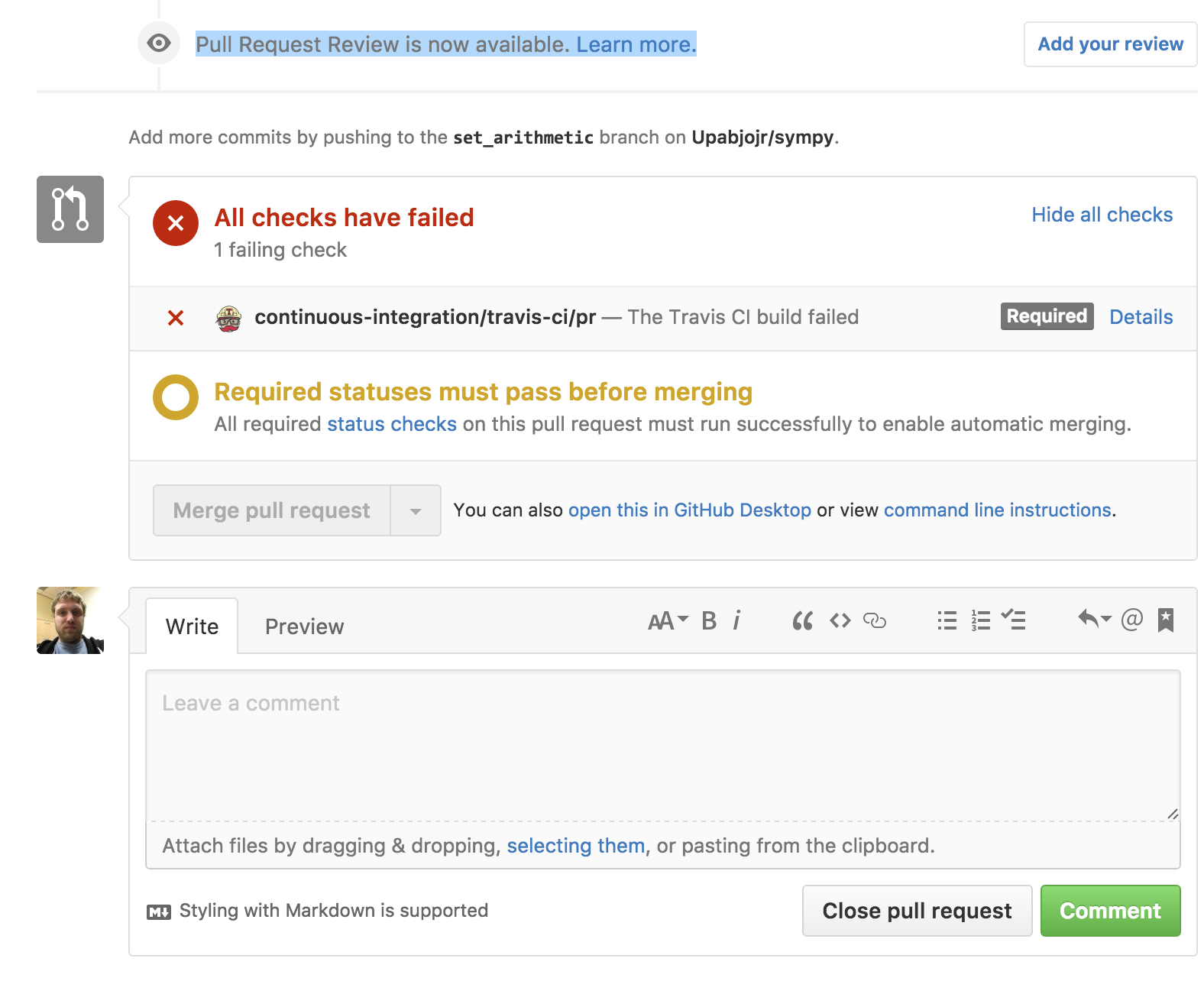
Basically, at the bottom of a pull request, you now see this

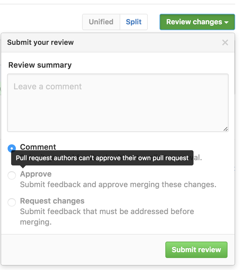
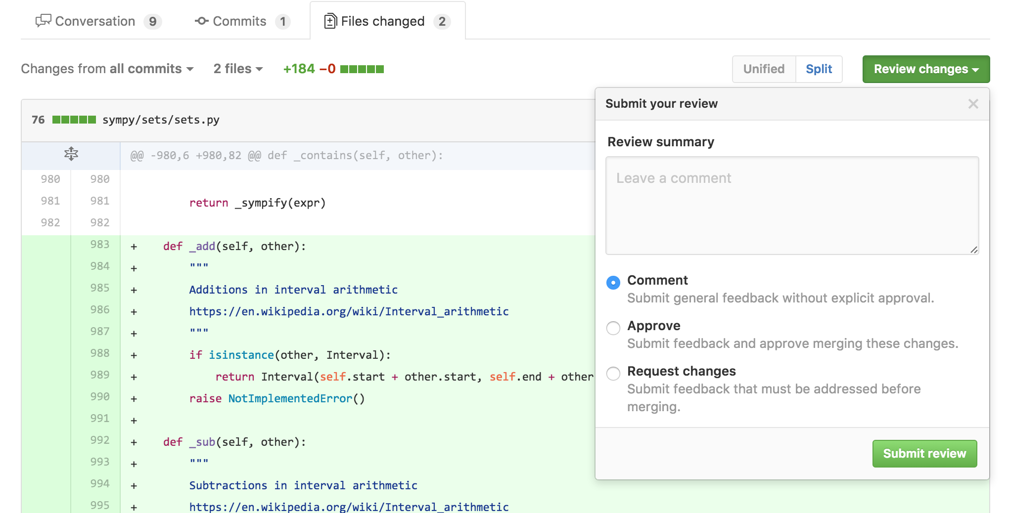
Clicking the "Add your review" button takes you to the diff page (first gripe: why does it move you to the diff page?), and opens this dialog

"OK", you might think, "this is simple enough. A review is just a special comment box where I can approve or reject a pull request." (This is basically the feature that I've been wanting, the ability to approve or reject pull requests.) And if you thought that, you'd be wrong.

The simplest way I can describe a review, having played with it, is that it is a distinct method of commenting on pull requests and on lines of diffs of pull requests. Distinct, that is, from the methods that already exist in the GitHub pull requests feature. That's right. There are now two ways to comment on a pull request (or on a line in a pull request). There's the old way, which involves typing text into the box at the bottom of the main pull request page (or on a line, and then pressing "Add a single comment"), and the new way, which involves clicking a special button at the top of the diff view (and the diff view only) (or by clicking a line in the diff and clicking "Start a review").

How do these two ways of the extremely simple task of commenting differ from one another? Two ways. One, with the old way, when you comment on a PR (or line), the comment is made immediately. It's saved instantly to the GitHub database, and a notification email is sent to everyone subscribed to the PR. With the new way, the comment is not made immediately. Instead, you start a "review", which postpones all comments from being published until you scroll to the top and press a button ("Review changes"). Did you forget to scroll to the top and press that button? Oh well, your comments never got sent to anyone.

Now, I've been told by some people that delayed commenting is a feature that they like. I can see how fewer total emails could be nice. But if you just want a way to delay comments, why do you need distinct commenting UIs? Couldn't the same thing be achieved via a user setting (I highly suspect that any given person will either like or dislike delayed commenting universally)? Or with a checkbox next to the comment button, like "delay notifications for this comment"? You can probably guess by now which of the two commenting systems I prefer. But guess what happens when I press the "Cmd-Enter" keyboard shortcut that's been hard-wired into my brain to submit a comment? I'll give you a hint: the result does not make me happy.

The second distinction between normal, old-fashioned commenting and the new-fangled reviews system is that when you finalize a review, you can elect to "approve" or "reject" the pull request. This approval or rejection gets set as a special status on the pull request. This status, for me personally, is the only feature here that I've been wanting. It turns out, however, that it's completely broken, and useless.

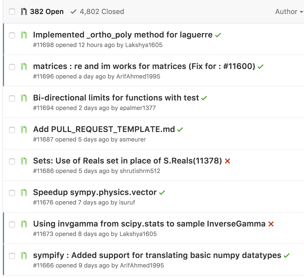
Here's my problem. We have, at the time of writing, 382 open pull requests in SymPy. A lot of these are old, and need to be triaged. But the problem from my point of view is the new ones. When I look through the list of pull requests, I want to be able to know, at a glance, which ones are "reviewable". For me, this means two things

  1. The tests pass.

  2. No other reviewer (myself included) has already requested changes, which still need to be made by the PR author.

Point 1 is really easy to see. In the pull request list, there is a nice green checkmark if Travis passed and a red X if it failed.

The second point is a disaster. Unfortunately, there's no simple way to do this. You might suggest adding a special label, like "Needs changes", to pull requests that have been reviewed. The problem with this is that the label won't go away when the changes have been made. And to worsen things, people who don't have push access (in the list above, only two PR authors have push access, and one of them is me), cannot add or remove labels on pull requests.

Another thing that has been suggested to me is an external "review" service that sets a status for a review. The problem with this (aside from the fact that I couldn't find one that actually did the very simple thing that I wanted), is that you now have to teach all your pull request reviewers to use this service. You might as well forget about it.

Having a first-class way in GitHub for reviewers to say "I approve these changes" or "I don't approve these changes" would be a huge boon, because then everyone would use it.

So great right, this new Reviews feature is exactly what you want, you say. You can now approve or reject pull requests.

Well no, because GitHub managed to overengineer this feature to the point of making it useless. This completely simple feature. All they had to do was extend the status UI and add a simple "I approve/I reject" button. If they did that, it would have worked perfectly.

Here are the problems. First, the pull request list has no indication of review status. Guess which pull requests in the above screenshot have reviews (and which are positive and which are negative). You can't tell (for example, the last one in the list has a negative review). If they were actually treated like statuses, like the UI suggests that they would, you would at least see an X on the ones that have negative reviews (positive reviews I'm much less worried about; most people who review PRs have merge access, so if they like the PR they can just merge it). I would suggest to GitHub to add, next to the status checkbox, a picture of everyone who's made a review on the PR, with a green checkmark or red X to indicate the type of review. Also, add buttons (buttons, not just buried advanced search options) to filter by reviews.

OK, so that's a minor UI annoyance, but it gets worse. Next on the docket, you can't review your own pull requests. It's not allowed for some reason.

Now why would you want to review your own pull request, you might ask? Aren't you always going to "approve" your own PR? Well, first off, no. There is such a thing as a WIP PR. The author setting a negative review on his own PR would be a great way to indicate WIP status (especially given the way reviews work, see my next gripe). Secondly, the "author" of a pull request is just the person who clicked the "New pull request" button. That's not necessarily the only person who has changes in the pull request. Thanks to the magic of how git works, it's quite easy to have a pull request with commits from many people. Multiple people pushing to a shared branch, with a matching pull request for discussion (and easy viewing of new commits and diff) is a valid and useful workflow (it's the only one I know of that works for writing collaborative prose). For the SymPy paper, I wanted to use GitHub Reviews to sign off on a common branch, but since I'm the one who started the pull request, I couldn't do it.

Next gripe, and this, I want to stress, makes the whole feature completely useless for my needs: reviews do not reset when new commits are pushed. Now, I just outlined above two use-cases where you might want to do a review that doesn't reset (marking WIP, and marking approval, although the second is debatable), but both of those can easily be done by other means, like editing the title of the PR, or old-fashioned commenting. The whole point of Reviews (especially negative reviews), you'd think, would be to indicate to people that the pull request, as it currently stands, needs new changes. A negative review is like failing your "human" test suite.

But unlike your automated test suite, which reset and get a new go every time you push a change (because hey, who knows, maybe the change ACTUALLY FIXED THE ISSUE), reviews do not reset, unless the original reviewers explicitly change them. So my dream of being able to glance at the pull request list and see which PRs need changes has officially been piped. Even if the list actually showed what PRs have been reviewed, it would be a lie, because as soon as the PR author pushes a change, the review status becomes potentially outdated.

Now, given the rocky start that this whole feature has had, I figured that this was probably just a simple bug. But after I reported it to GitHub, they've informed me that this is in fact intended behavior.

To make things worse, GitHub has another feature with Reviews, called required reviews. You can make it so that every pull request must receive at least one positive review and zero negative reviews before it can be merged (go to the branch settings for your repository). This works similar to required status checks, which make it so that your tests must pass before a PR can be merged. In practice, this means you need zero negative reviews, since anyone with push access could just do a positive review before merging (although annoyingly, you have to actually manually do it; IMHO, just requiring zero negative reviews should be sufficient, since merging is implicitly a positive review).

Now, you can see that the above "feature" of reviews not resetting breaks the whole thing. If someone negative reviews a PR, that one person has to go in and change their review before it can be merged. And even if the author pushes new changes to fix the issues outlined in the review, the PR cannot be merged until the reviewer resets it. So this actually makes the reviewing situation worse, because now anyone who reviews a pull request at any point in time has to go through with it all the way to the merge. I can't go to a PR that someone requested changes for, which were later made by the author, and merge it. I have to ping the reviewer and get them to change their review first. Needless to say, we do not have this feature enabled for SymPy's repo.

I think I maybe see the intended use-case here. You want to make it so that people's reviews are not forgotten or ignored. But that's completely foreign to my own problems. I trust the SymPy community, and the people who have push access to do due diligence before merging a pull request. And if a bad change gets in, we can revert it. Maybe this feature matters more for projects that continuously deploy. Likely most of the code internal at GitHub works like that. But guess what GitHub, most of the code on GitHub does not work like that. You need to rethink this feature to support more than just your use-cases.

I think starting simple, say, just a simple "approve/reject" button on each PR, which just adds an icon, and that's it, would have been a better approach. Then they could have listened to the feedback on what sorts of things people wanted it to be able to do (like setting a status, or showing up in the search list, or "delayed commenting" if that's really what people want). This is how GitHub used to do things. It's frustrating to see a feature implemented that doesn't (yet) do quite what you want, but it's even more frustrating to see a feature implemented that does all the things that you don't want.

Summary

Yes, I'm a little mad here. I hope you enjoyed my rant. Here are what I see as the problems with the "Reviews" feature. I don't know how to fix these problems (I'm not a UI/UX guy. GitHub supposedly hires them, though).

  • There are now two distinct ways to comment on a PR (delayed and non-delayed). There should be one (say, with a checkbox to delay commenting).

  • If you insist on keeping delayed commenting, let me turn it off by default (default = the Cmd-Enter keyboard shortcut).

  • The reviews button is buried on the diff page. I would put it under the main PR comment box, and just reuse the same comment box.

  • Reviews should show up in the pull request list. They should be filterable with a nice UI.

  • Let me review my own pull requests. These can be excluded from required reviews (that makes sense to me). Beyond that, there's no reason this shouldn't be allowed.

  • Don't require a positive review for required reviews, only zero negative reviews. Merging a PR is implicitly positively reviewing it.

  • Allow reviews to reset when new commits are pushed.

I get that the last point may not be what everyone wants. But GitHub needs to think about UI, and defaults here. Right now, the UI looks like reviews are like statuses, but they actually aren't because of this.

I am dispirited to see GitHub release such a broken feature, but even the best trip up sometimes. I'm not yet calling "doom" on GitHub. Everyone has their hockey puck mice. I'm actually hopeful that they can fix these issues, and implement a feature that makes real headway into helping me solve one of my biggest problems on GitHub right now, the reviewing of pull requests.